Recently I had the pleasure of talking to artist and legendary Stiff Records Art Director Chris Morton AKA c-more-tone. I asked him about the days of creating the memorable and iconic artwork for the Pack, Theatre of Hate and Spear of Destiny.
Chris gives us a personal insight into his time working with Terry Razor, the band, the invention of the mask icons and the ideas behind the sleeve designs, plus, he answers that good old pub argument of just who that bloke on the Westworld cover was, read on...
…my childhood creative & visual influences were mainly cartoons & comic strips - particularly anti-authoritarian ones like Bugs Bunny & Daffy Duck and Alfred E Newman’s Mad comic…
…My fascination with ‘moving images’ - particularly hand-drawn ones - started when I was four with the first film I ever saw; Fantasia - my only other childhood visit to the cinema was to see Pinocchio - although I was lucky enough to see occasional B&W ‘one-reelers’ such as the adventures of the cowboy Kit Carson on the wall at home as my Dad ran a mobile film projection unit for a while…
I didn’t get to see television until I was seven but have always favoured all forms of animation - especially if it’s dream-like or surreal…
…by the time I was doing O & A Levels my biggest influence was Pop Art with Andy Warhol & Roy Lichtenstein in particular…
…that led to a pre-art school Foundation Course - at Bath Lane, Newcastle in 1972 - which completely changed everything for me - when my love of music collided with a new found visual worlds combining multiple & moving imagery and that set up a lifelong romance - starting with Andy Warhol’s ‘Plastic Exploding Inevitables’ at the Factory in New York and discovering The Velvet Underground…
Then, going to Norwich School of Art (for the pre-BA degree course; a DipAD - Diploma in Art & Design…) led to my first mind-blowing visual experience with the discovery of psychedelic music concert posters & underground comics - particularly from San Francisco with comic artists like Victor Moscoso and music poster & album cover artists like Rick Griffin and Mouse & Kelly in particular…
…this, unsurprisingly, went hand-in-hand with an immersion in the ‘acid trip’ music of Quicksilver Messenger Service and principally; The Grateful Dead - it was here that I did my first posters for myself - for my Student Union ‘Frisco Discos’ that were tangential to the contemporary, orthodox design I was being taught - so much so, that I was politely persuaded to leave at Easter of the final year as they didn’t think my style of work fitted the course and they insisted I wouldn’t get a design studio job anyway…
After I left college and went naively & optimistically ‘freelance' - initially looking for illustration and logo & lettering work in the music industry - after some work for Pete Frame’s underground music magazine Zigzag & weirdly, a short lived comic strip for Men Only - I finally got commissioned to do a poster for the Grateful Dead only for their 1975 UK tour dates to be cancelled…?!
…However, all was not lost as, by a wonderful happenstance, next came Stiff…
In early 1976, I had gotten a commission for a letterhead and logo for a music management company and met the influential and highly respected A&R man; Andrew Lauder, who invited me to show my folder of work at United Artists. He commissioned me to do a new look & logo for the George Hatcher Band (an Allman Brothers-style band) which involved my first ever meet-the-band-backstage appointment (before seeing them play live...). Marvellously for me, this was at the Roundhouse in Chalk Farm, North London. While I was there watching from the wings, I saw someone I’d met briefly with Andrew who was the tour manager of the band George Hatcher were supporting, Doctor Feelgood. That was Jake Riviera. He said he remembered meeting me and seeing as I did record cover stuff – which I hadn’t technically actually done yet – would I like to do some roughs and ideas for a new record label he was setting up?
He went on to explain that his intention was to emulate the 1940s & 1950s American independent record label guys “who’d fill the trunk with newly pressed 45s and drive around delivering them to juke joints and local radio stations”. At that time there weren’t any independent labels in the UK – there was only the seminal Skydog label in Paris, while Beserkley Records in California were only just getting started – both would soon become involved with the fledgling Stiff…
This stems from my life-long fascination with halftone dots and how they were used to print black-and-white ‘photographs’ in newspapers. The nickname came about via Stiff’s MD, Dave Robinson’s idiosyncratic pronunciation – instead of saying my name Morton as ‘more tun’ he’d say (or usually shout in an Irish lilt from his office) ‘more tone’. As a lifelong lover of puns and Spoonerisms, it soon occurred to me that seeing as my first initial also sounds like ‘see’ here was a hilarious opportunity not to be missed. Well, amusing for a while...

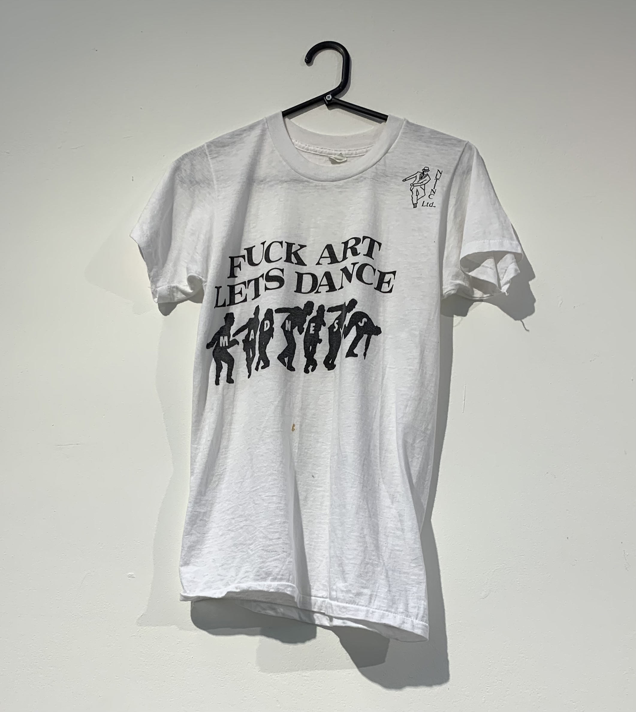
I am particularly proud of the early cover I did for Richard Hell & the Voidoid’s (I belong to the) Blank Generation - also the ‘Fuck Art, Let’s Dance…” T-shirt* and the “Home Taping is killing the Industry” logo (which it wasn’t..!) - and importantly all the stuff I did for The Plasmatics, Tenpole Tudor & Lena Lovich - which were formative & crucial in the development of my nascent ‘graphic style’ that flowered with Theatre of Hate…
...when I originally did that logo, whilst still at Stiff, it was meant for a poster & t-shirt for my all-time favourite band; The Cramps - for whom I was doing an ad campaign for their first album - which, if I’d had my way, the cover of which would have been just stark, faux blue suede - with the title, text & photos on the inner/liner bag... (I’ve still got that tactile, flock-effect cover our then sleeve printers mocked up for me...)
Lux & Ivy had given me a pre-release white label pressing of the album to play to Dave Robinson with a view to hopefully releasing it on Stiff - alas, it was not to be - however Dave was so taken by the “fuck art, let’s dance...” concept that he politely ‘convinced’ me to use it for Madness - an argument I couldn’t really counter as he’d been employing me for over 4 years as well as letting me do freelance work in the evenings when we weren’t all working late or checking out new bands..!
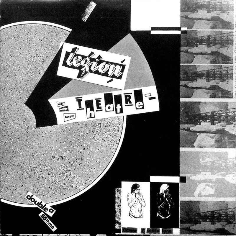
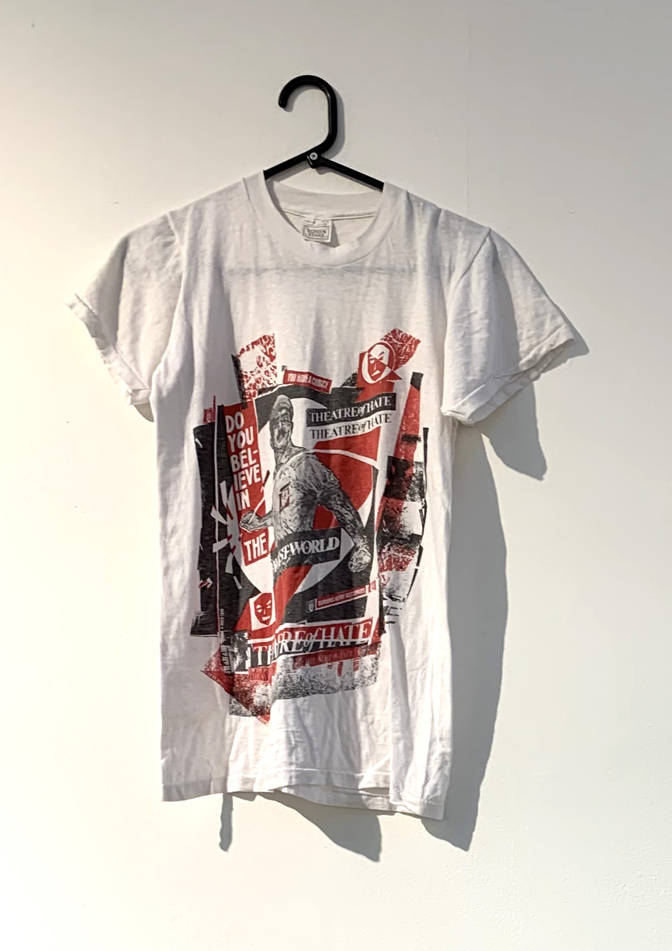
…I was initially attracted to their particular ‘sound’ & Kirk’s singing style - which always helps when you’re working with a new band - and the 'briefs' I got for designing stuff for the Theatre of Hate (and also for their precursor; The Pack and their later; Spear of Destiny...) were amongst the handful of my 'all time great commissions’ because their manager, the redoubtable Terry Razor - who I knew from his time working in the ‘Stiff Shop’ - would come into the art department - occasionally with Kirk Brandon - and say "we need a new cover" telling me the title & sometimes giving me a cassette - that was it - I was given 'carte blanche' because they liked what I'd done for them and that in turn inspired me to do some my best work for them...
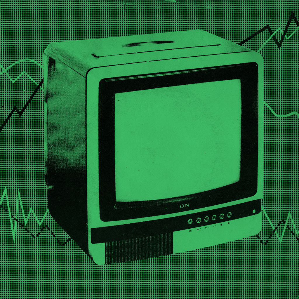
Always loved the Sony TV, it featured a lot on the Pack sleeves, was there a story behind it?
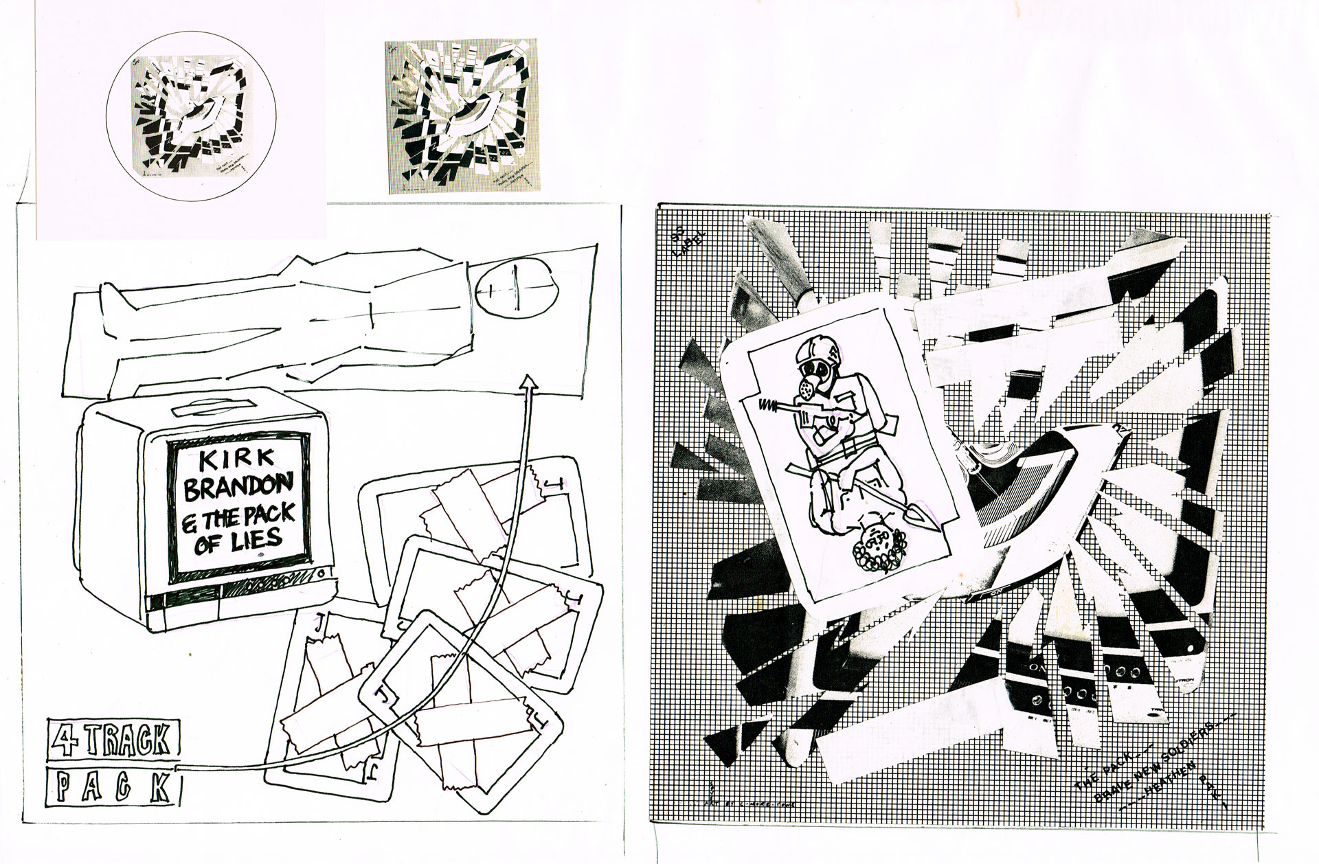
the original roughs & layouts I did for the 4 track EP....
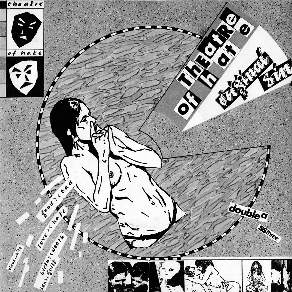
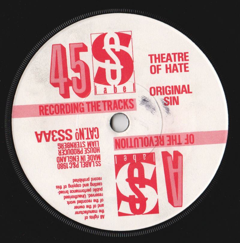
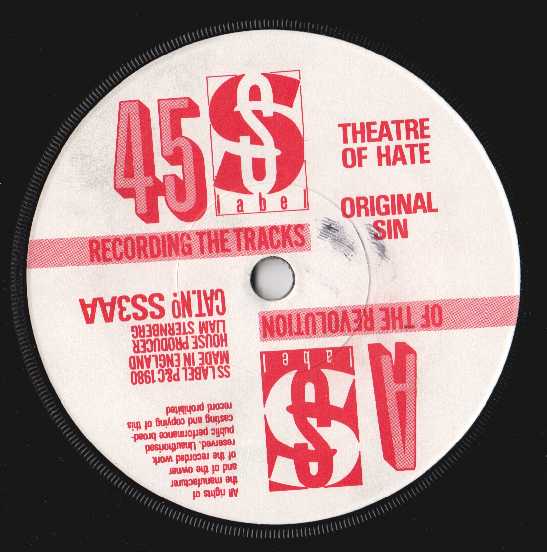
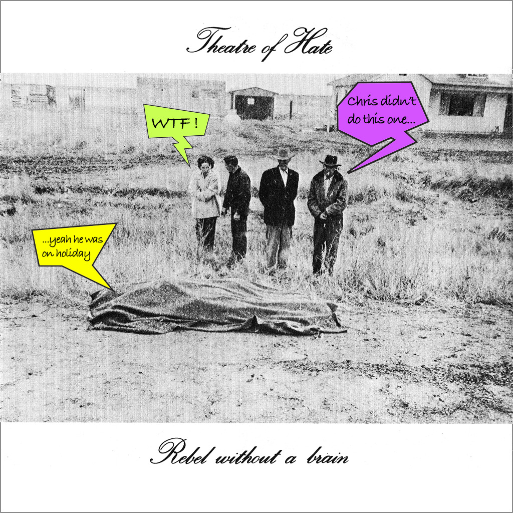
When the Pack disbanded, your unique style transferred to TOH in the form of Original Sin, another classic c-more sleeve. Can you tell me the inspiration behind it?
Sadly for me I didn’t get to do that one - as when Terry Razor came into the art dept to commission it I’d only just gone on a much-needed holiday…
…although I’ve since been able to do this cover - and match in up stylistically - in the upcoming new project I mentioned…
Also this is the first time we see the rape alarm design on the sleeve label, any story behind this?
"just the job I thought to subliminally advertise the Theatre of Hate’s attitude & sonic qualities..!"
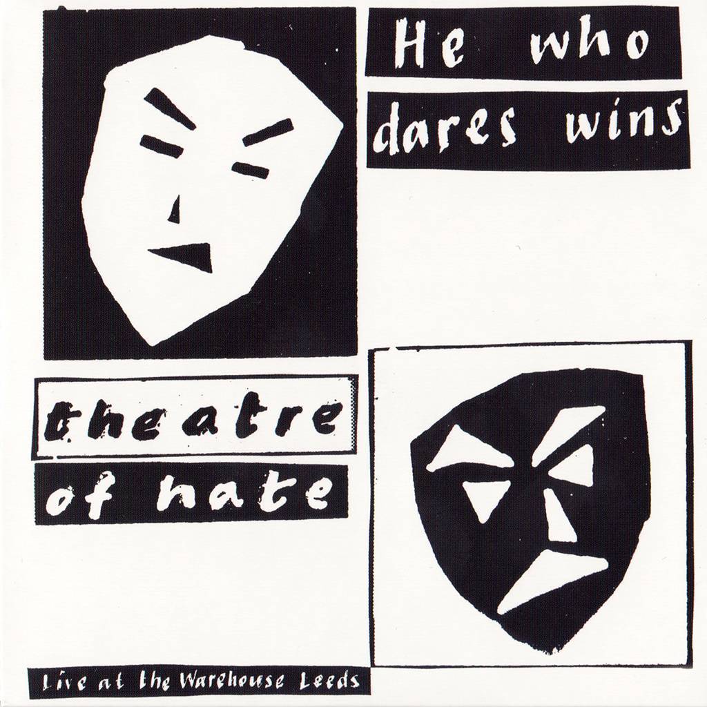
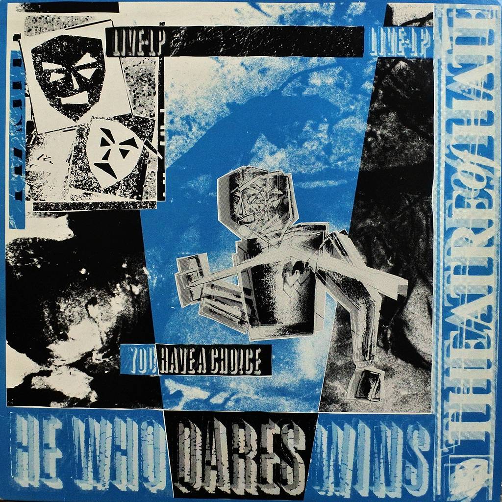
We’ve been talking about singles so far, but you were involved in the album cover designs, one in particular, Live at Leeds, which was quite a rudimentary design considering the Original Sin sleeve, can you tell us about it?
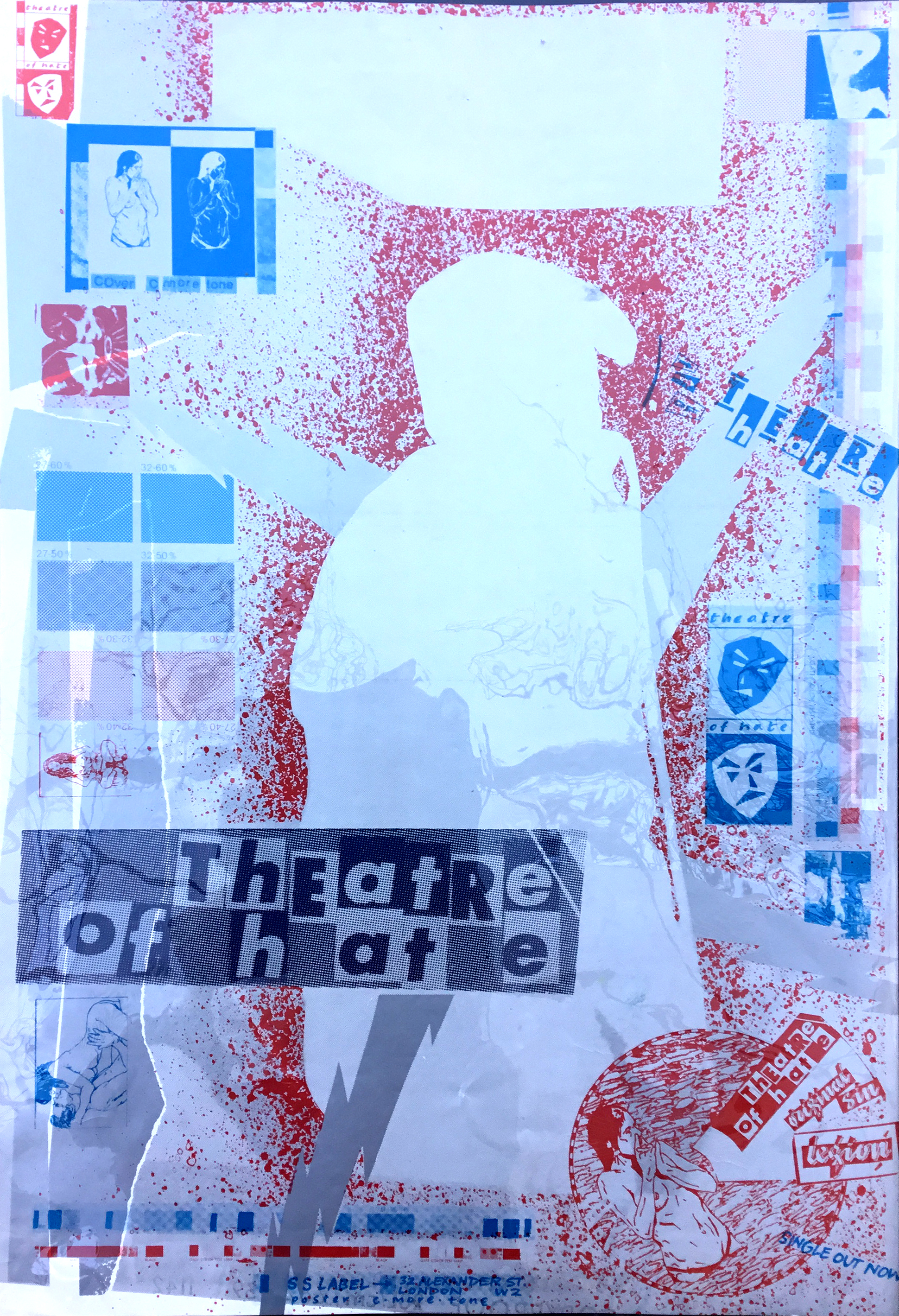
I told the band their new logo was called the ‘tragedy & tragedy’ masks - as opposed to comedy/tragedy ones and they were originally ‘drawn’ with a scalpel - perhaps that’s why some people see them as ‘potato heads’..? It was meant to suggest & reflect what hard work it was ‘being a punk’ - keeping up the attitude didn’t come with many laughs - at least in public…
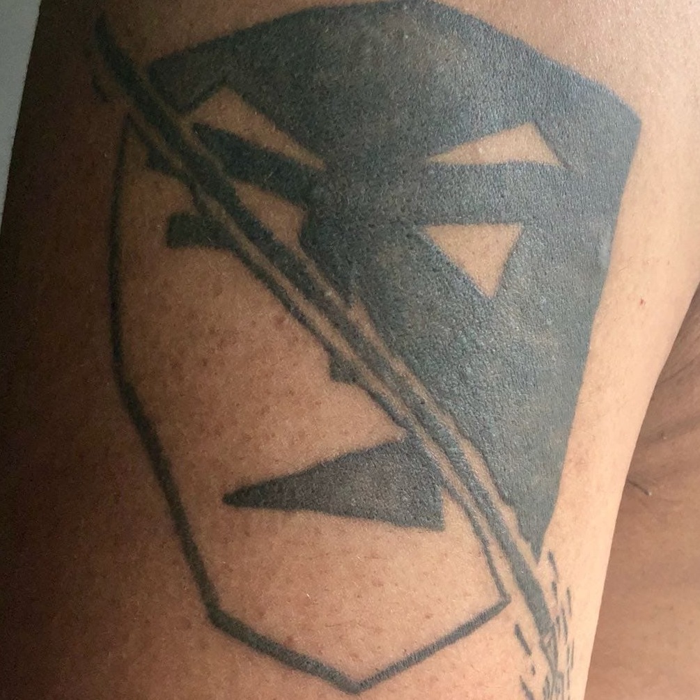
The icon is such a powerful symbol for the band, it’s made many a good tattoo over the years, must be good to know it was well received.
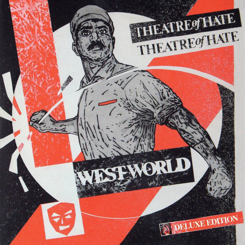
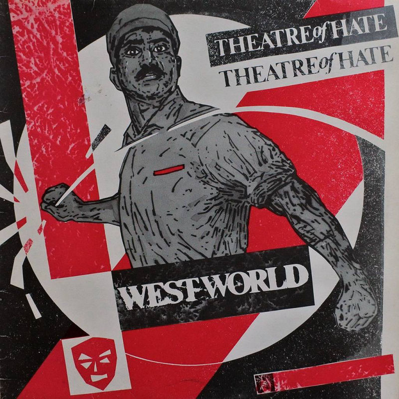
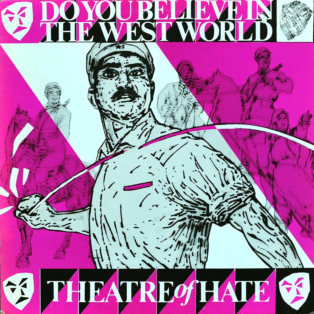
The iconic album sleeve...but who is the man on the cover...
Ah, a popular question - well, it’s not the much-suggested Polish dissident union leader & later prime minister, Lech Walesa - although symbolically close - it’s based on a romanticised military figure from Chinese cultural revolution propaganda poster leading his people to a better world - perhaps, I dreamt, like one that would feature lots of Theatre of Hate gigs..?!
Do you still have any concept work for the sleeve? Or the original image that inspired you?
…breathtaking..! - Kirk & Terry gave me a pre-release cassette of the album which I really loved - especially the title track - and that inspired the idea for heroic figure motif that became the embodiment of the Theatre of hate - plus we were all really impressed with the Yul Brynner-starred movie and its concept..!
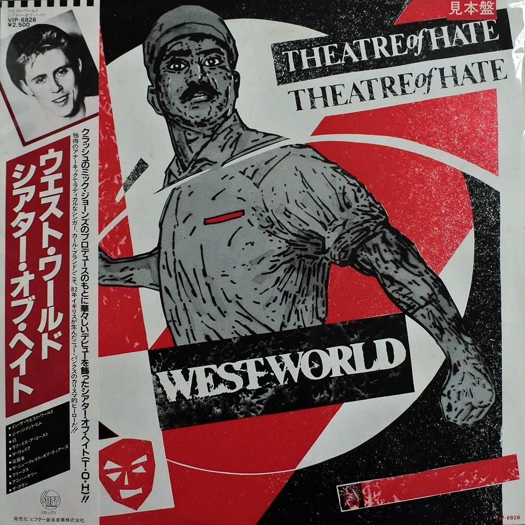
Not really - I was thrilled for Kirk that it was a big hit - but I didn’t realise it’d gone that far..!
I still have the original album & single bags artwork & its first proof copy & I’ve got the original a/w for the t-shirt…
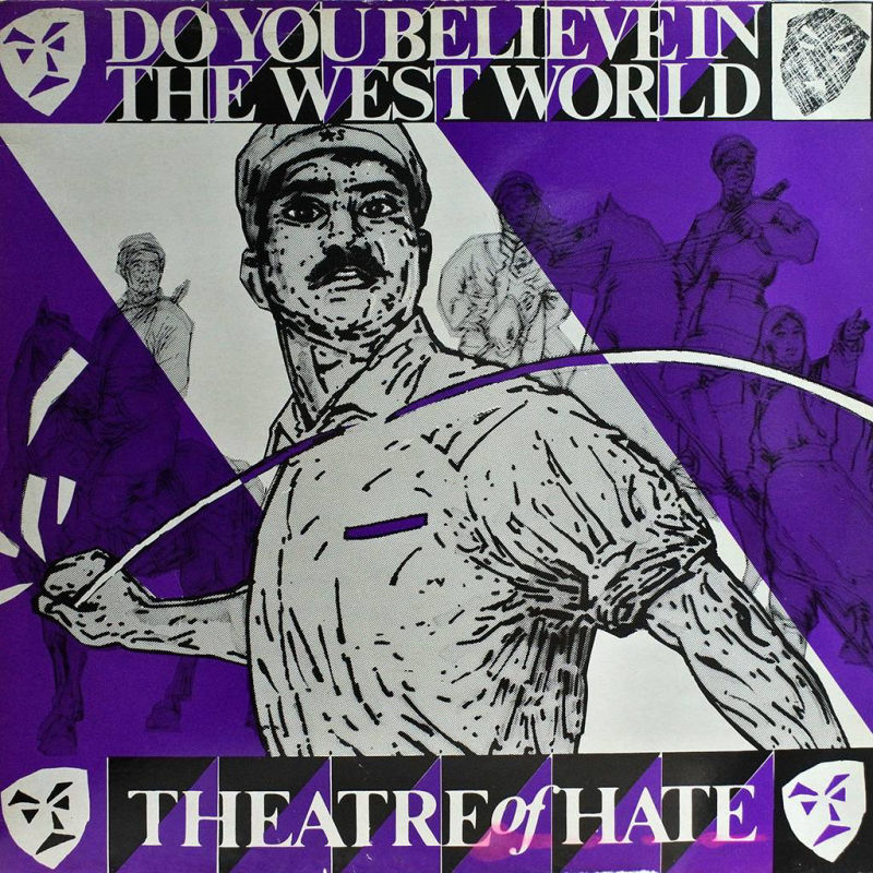
A firm favourite of TOH fans...
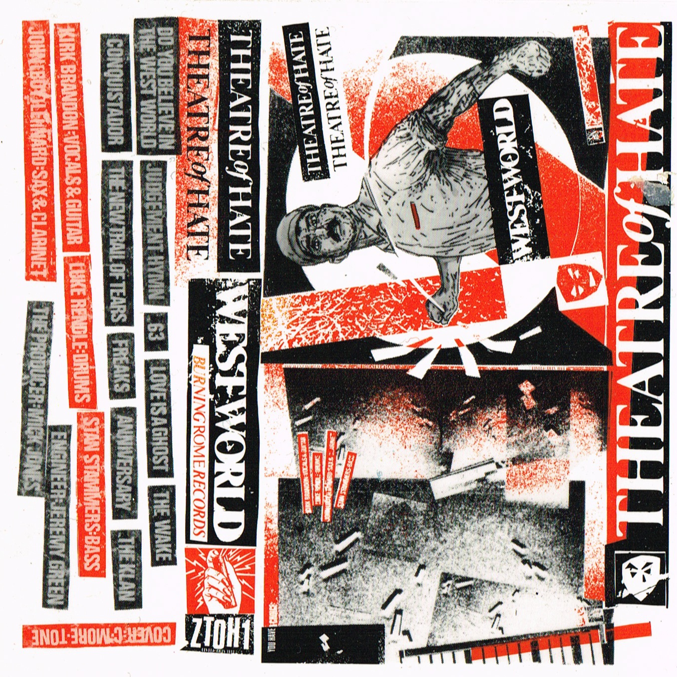
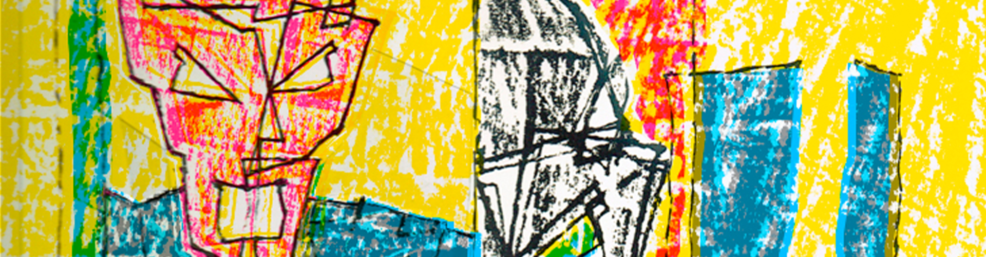
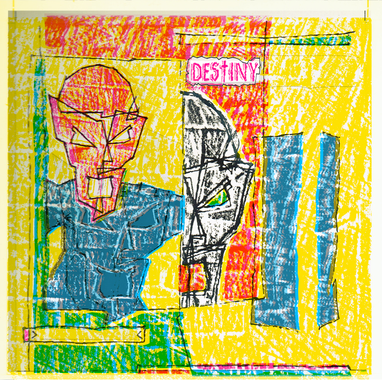
Yes, one of my all-time faves too - conceptually as well as visually - as this was my first ‘abstracted development’ of the Westworld’s heroic figure motif - cajoling the aforementioned process camera I was experimenting with into photographic ‘tricks’ combining drawings & textures…
The sleeve has always been a firm favourite, can you tell us your inspiration behind the design?
Did he exist in any other form?
Another couple of sleeves turn up next Eastworld 7 and 12” they don’t look like yours – how come?
…not really sure how I missed out on this one - that was really frustrating - however I’ve been able to use my original follow-up idea in the new project…
…I found out much later that apparently the band were sent a postcard from East Germany and decided to use it for the cover…

Yes, I was/am very proud of that cover - the first stage was to print all the unfolded covers solid black all over - then once dried, overprint the text & image using just a clear matt varnish - when it dried you could only see/read it when you tilted the cover in the light…
…the idea was ‘reflect’ (emperor) Nero’s darkness & play on ‘nero’ also being Italian for black - subtle (nearly) & a fun visual pun - happy daze..!
There was a provision in/on the artwork for a 7” version but it never seemed to appear..?
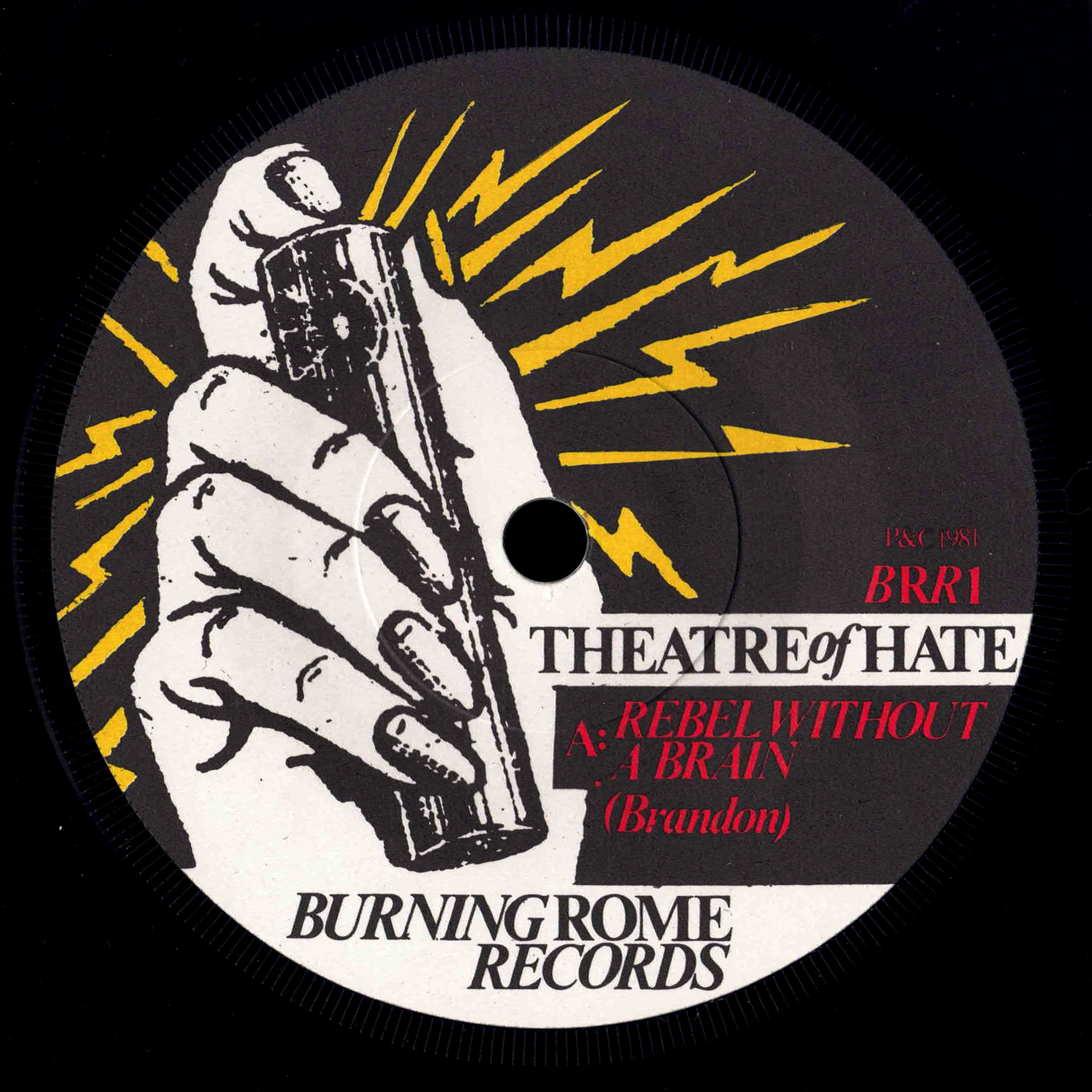
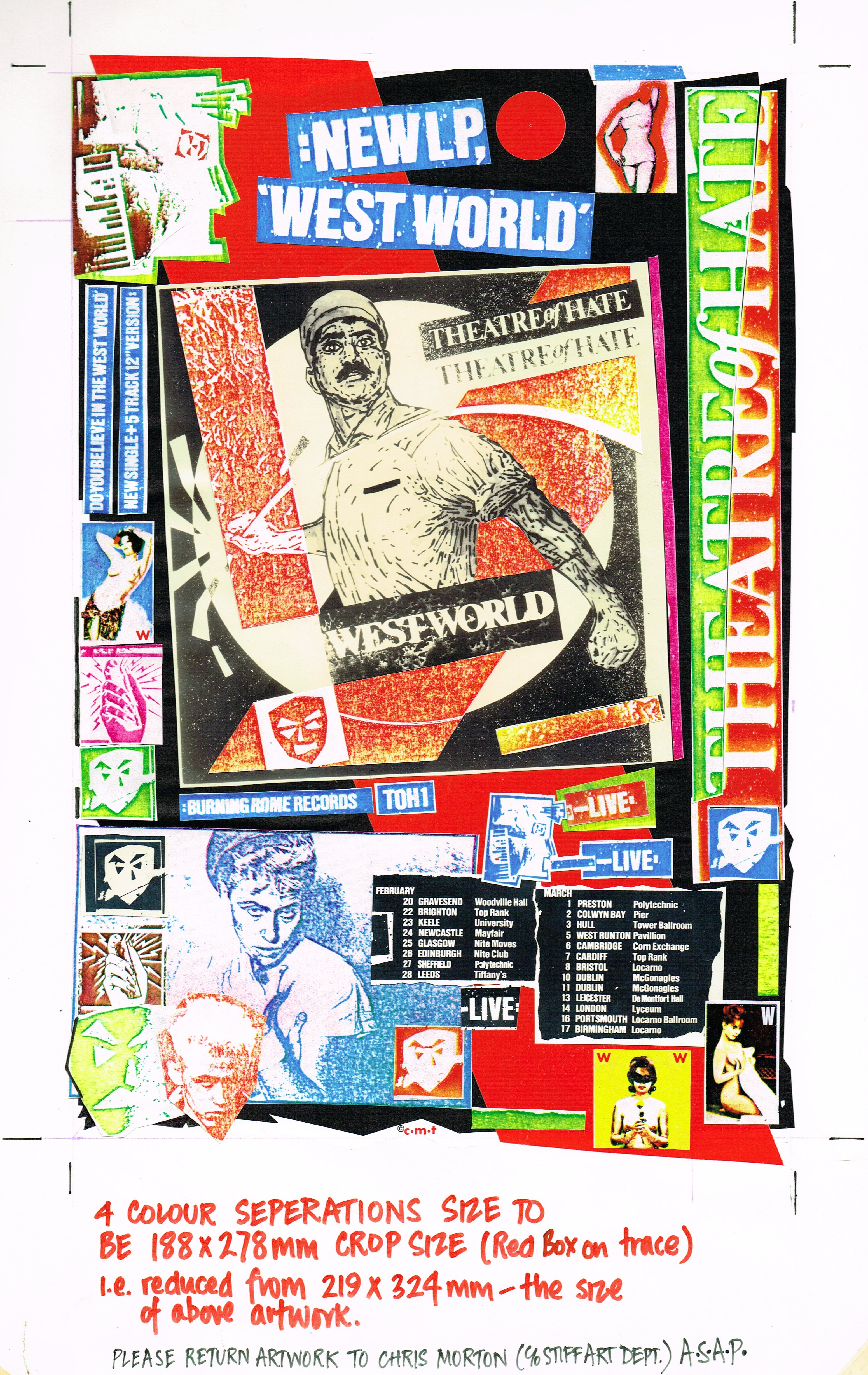
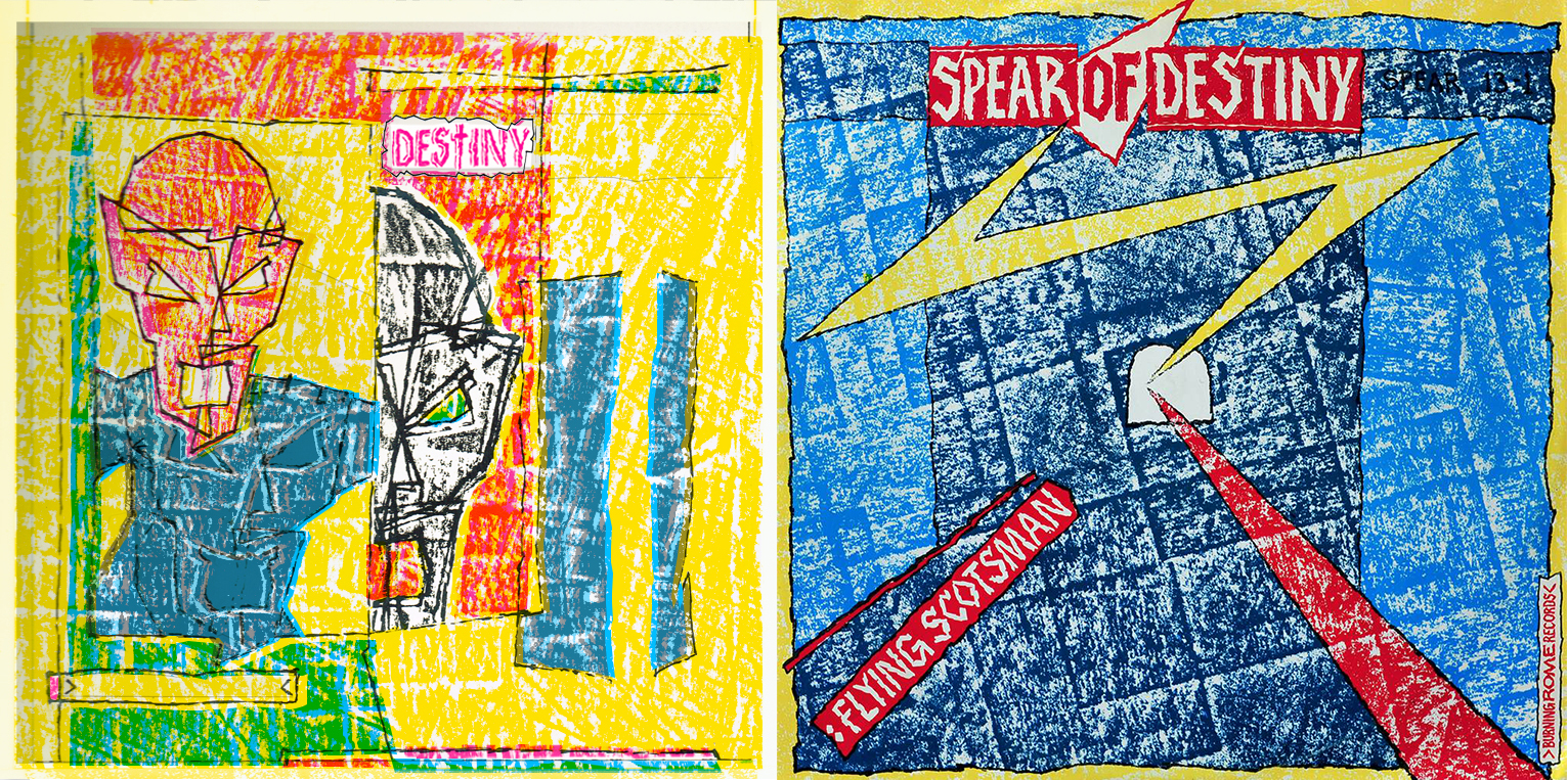
When Theatre of Hate ended (or 'went dark') and Kirk formed Spear of Destiny they were signed by CBS for their Epic label - I was asked to design the first single and ad campaign so as to keep some visual continuity and appeal to Theatre of Hate fans...
...this ended up proving problematic as the major record companies are a good/bad* example of corporate, music industry 'double speak' - a risk-averse, profit-only multinational trying to be 'cool & down with the kids' who's marketing depts openly & unironically used the word 'exploitation' for their generic ad campaigns who’s stated aim was ‘optimal amounts of units shifted’…
…it all came to a head in the first meeting with them for me and the band - because for the new singles' covers I had redesigned an updated version of the 'twin masks' logo and further developed the 'graphic style' I'd made for Theatre of Hate - and even though the band & management were keen Epic's marketing dept thought it was 'too deep and too dark' and ‘not Top of the Pops’ enough - insisting on dumbing it down and just using the background bits…
*depending on your views on how capitalism deals with creativity and the 'art for art's sake' principle…
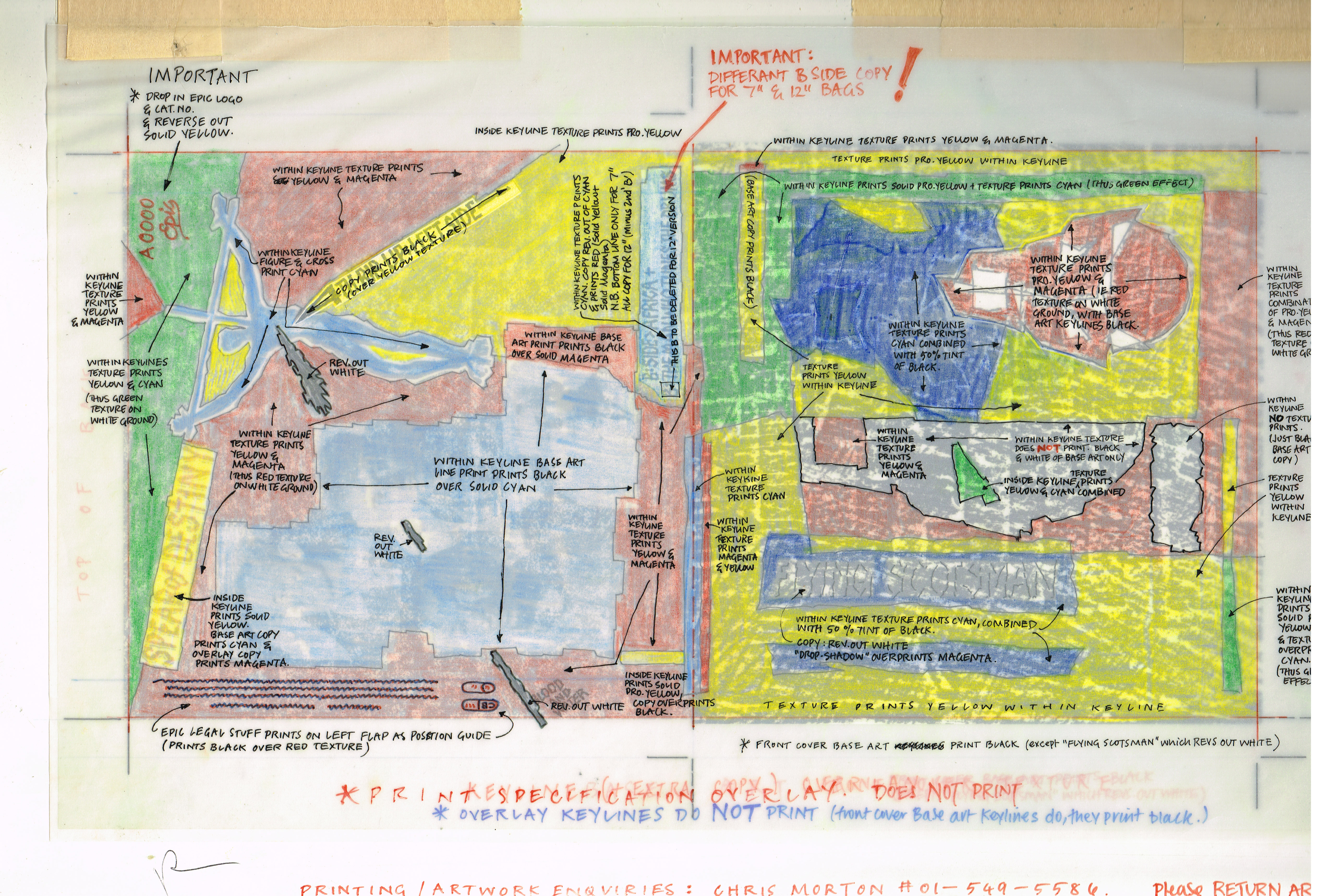
On the revised cover version that did appear there is only one background texture - taken from the unseen version - used for the back & front of the 7"& 12" single bags and although it doesn't seem like it at first glance each the 4 covers’ sides use the same areas of the basic texture but are printed different overlapping colour combinations - this was varied again for the free 12”45 poster & the large street poster…
...it was made by sticking differing short lengths of masking tape to a cutting mat - mainly at right angles to each other in a slightly random, generic 'crossword puzzle-cum-street map' pattern - then 'roughing it up' with sandpaper & random scalpel cuts...
...this was then covered with a large sheet of thick tracing paper and rubbed over with the side of a black wax crayon (like doing a brass rubbing - also known as frotage...) to create the rough texture effect - the sheet was then moved slightly up & across and re-rubbed again - then moved down & across the other way for a third rubbing to create the final multiple image/overlapping effect...
...you had to go to great lengths then to make something unusual that was also hard to work out how it was done - that can now be quickly done with Photoshop by duplicating & moving 3 layer copies out of sync..?!
I’ve got the original roughs & layouts for the revised/new masked logo, the original single bag a/w (and a reproduction of how it would’ve looked…) plus a proof of the cassette single that never was…

Drag & Drop Website Builder